Some of my favourite devices have one thing in common—they’re beautiful.
Now, we might disagree on what’s beautiful and what isn’t, but the point is that I’m a bit of an aesthete when it comes to products.
That’s one of the reasons why I’ve been fascinated with Nothing’s products, which led me to review the Ear (2). And now, I’m finally getting my hands on the Nothing Phone (2).
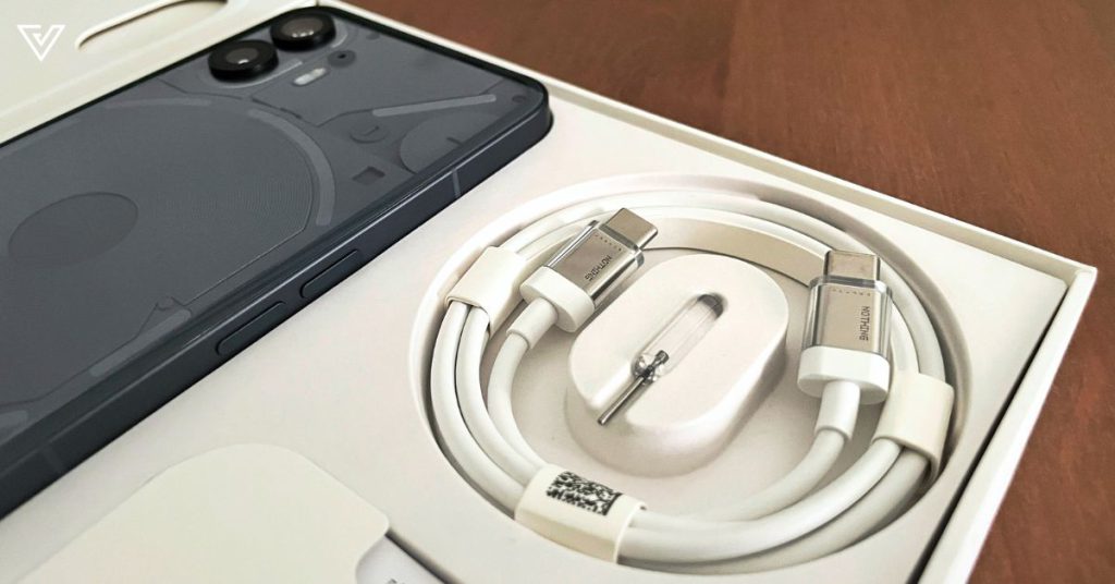
In the box is a Type-C to Type-C charger that’s honestly beautiful in its own right. Just as lovely is the ejector pin.
And of course, the beautiful phone itself.
A stylish statement
Between the dark grey and white colourways, I personally found the latter to be more interesting-looking, though the dark colour is always a safer bet—and the darker colour we got.
The phone looks rather similar to the Nothing Phone (1), but is slightly larger with a 6.7-inch OLED screen (compared to the former 6.55-inch one).
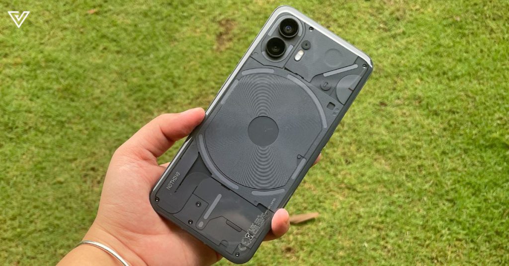
The phone’s “gently curved pillowed glass back”, as described by Nothing itself, is sleek and smooth, but the whole device runs a little big for me.
Despite the slightly curved back, the phone is pretty angular, which makes gripping it properly a little tricky at times (especially for small hands). Those worried about dropping it can rest assured knowing it uses Corning Gorilla Glass, though.
At 201.2g, the phone is heavier compared to its predecessor, and comparable to the iPhone 14 Plus.
Under the hood, there’s a Qualcomm Snapdragon 8+ Gen 1 processor, and three capacity options:
- 8GB RAM + 128GB storage
- 12GB RAM + 256GB storage
- 12GB RAM + 512GB storage
Does function follow fashion?
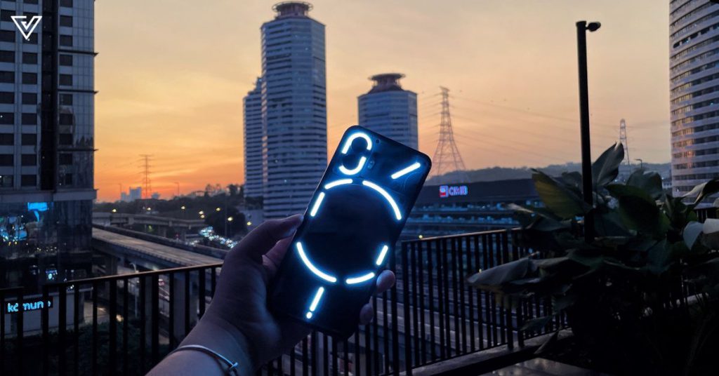
The Glyphs (which refer to the flashy LED panels on the back) are obviously one of the coolest things about the phone, and I will say I spent a good amount of time exploring its customisable options.
The additional Composer app also lets you play around, GarageBand-style, with your own Glyph ringtones.
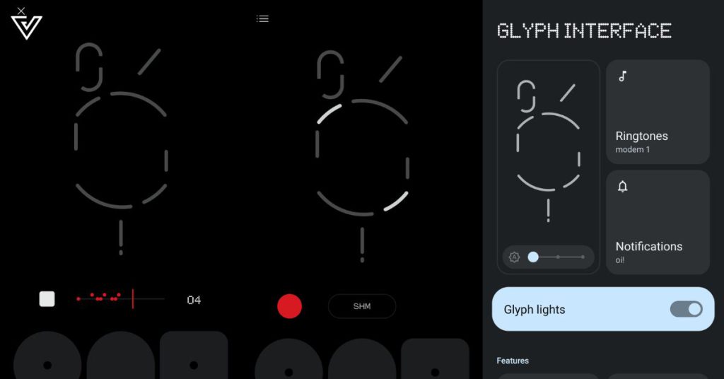
There’s a total of 33 individually addressable Glyph zones, more than twice compared to the original Nothing Phone (1)’s 12 addressable zones.
If you don’t know about Nothing’s philosophy, let me explain it briefly. The goal is to help users focus more on the world rather than the phone. This is something that the Glyphs aim to do, by letting users put their phones, face-down, while out and about.
Instead of looking at the phone screen, users can assign different light and sound sequences for each contact and notification type, and only react to notifications that are assigned as urgent.
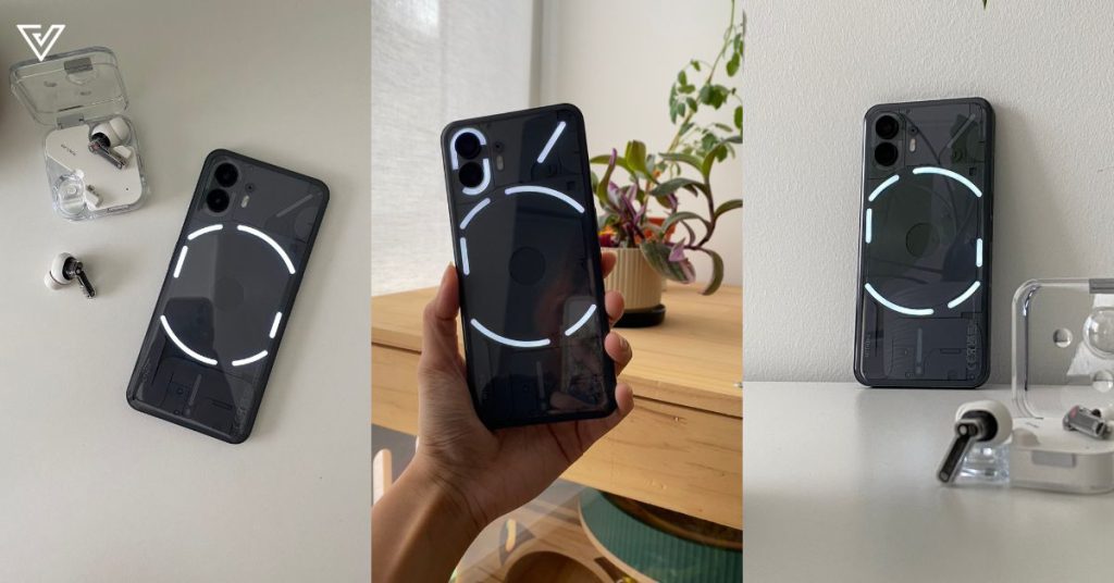
However, as someone who is admittedly a little addicted to my phone and not exactly working to fix that, the Glyphs function might have been a bit counterintuitive.
That said, I do really like it. It’s cool, functional, and did I say cool? I just love the way it blinks and flashes at me like some futuristic technology.
A note on the OS
Setting up the phone, we decided on the Nothing OS 2.0, an Android-based interface. You can also opt to set up the phone with Android 13 instead.
The software was fluid, with plenty of customisation opportunities. The widgets, monochrome palette, font, and more, just make everything feel so unique and futuristic—perfectly cohesive to the exterior of the Nothing Phone (2).
Aligning with Nothing’s philosophy, there are plenty of widgets that eliminate the need for you to open up apps to do mundane tasks and risk getting distracted.
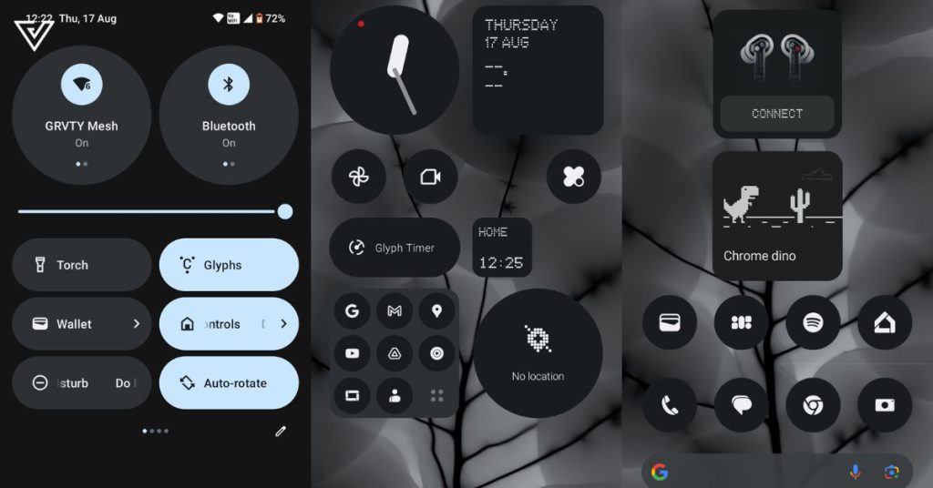
The shortcuts go from quick settings such as accessing your torch or screen cast, and I don’t know, accessing the Chrome Dino game with just one click?
Another thing about Nothing is that it takes out the bloatware, keeping the experience clean, without random games and apps you’ll never use inadvertently being downloaded as you set up your phone.
It’s beautiful, clean, and purposeful, just like the rest of the phone.
Nothing’s perfect
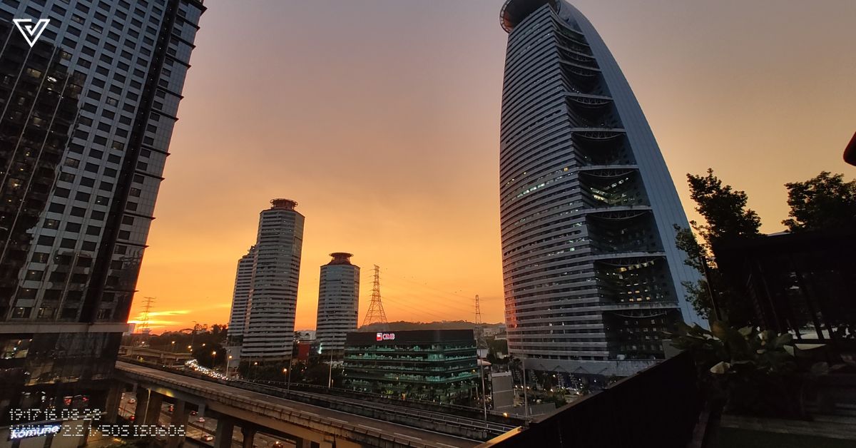
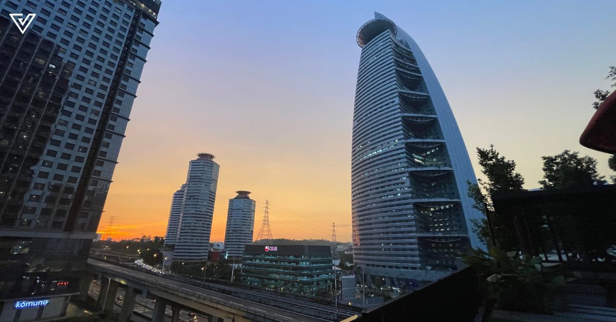
While the design elements of the phone were great, I would say that the camera quality is not as spectacular.
With a 50MP dual rear camera and a 32MP front camera, it works perfectly fine, just nothing to shout home about, especially compared to many other phones in the market with absolutely stacked cameras, like the Huawei P60 Pro or the Samsung Galaxy S23 Ultra.
Both pictures below were taken at the same time, on the same day.
I did like the video quality, though. It supports 4K 60fps recording for the back camera, and 1070p at 60fps for the front.
However, audio quality was one of my least favourite things when using this phone. There’s a muffled quality to it, and it is almost on the level of my laptop’s recording capabilities. The quality is especially poor in video recordings, compared to just voice recordings.
With an IP rating of IP54, this means the phone is only splash and dust-resistant. Many phones nowadays have graduated to IP68.
The verdict
The specs don’t particularly lag behind compared to other phones on the market, such as its LTPO OLED display with 1 to 120Hz refresh rate and 2412×1080 pixel resolution.
Its 4700mAh battery life was surprisingly long-lasting despite my playing around with the Glyphs for hours on end.
When it comes to the Nothing Phone (2), I find the aesthetics do outweigh the functionality, but that doesn’t at all mean that it doesn’t function well. By all means, it’s a decent phone, but not exactly the most capable when it comes to the hardware.
I do find the RM2,999 price tag to be somewhat reasonable, especially for those who love a beautiful and unique phone.
In a nutshell, the Nothing Phone (2) has the aesthetics of an iPhone and the functionality of an Android, while still having an identity that’s uniquely Nothing.
As an iPhone user myself, the Nothing Phone (2) might be one of my top picks of a phone to switch to (should I ever choose to quit the Apple gang).
| Pros | Cons |
|---|---|
| Beautiful and functional design | Only splash resistant |
| More customisable Glyphs and widgets | Poor audio quality |
| A pleasant OS with no bloatware |
VP Verdict is a series where we personally try and test out products, services, fads, and apps. Want to suggest something else for us to try? Leave a comment here or send the suggestion to our Facebook page.
The Nothing Phone (2) has more customisable LEDs to help reduce your screen time, so what? - Vulcan Post
Read More

No comments:
Post a Comment